Eleven Color Experts Share Their Color Secrets
Morpholio Launches Swatch Maker
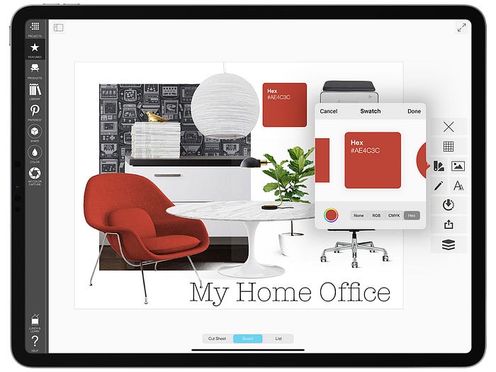
Today, Morpholio Board launches a color tool, that will change how you work with color, making your design boards smarter and more beautiful than ever. As designers, we’ve all been there! You see a gorgeous color inspiration image on a blog or Instagram and wonder how to get that vibrant tone for your home, client, or project? Whether it’s the bright yellow of a butterfly wing, the mocha of a perfect Cappuccino, or Yves Klein’s iconic blue, the color we capture in the world is delicious and inspires our design schemes every day.
Now, Morpholio solves this problem by bridging the digital divide with its new Swatch Maker, inside the already popular mood boarding app, Morpholio Board. This is the first ever mobile mood boarding tool to offer you vivid and editable swatches with accurate RGB, CMYK and Hex color data. Work fluidly amongst digital samples of furniture and finishes, turn inspiration images into actual color schemes, and even build a library of your favorites to turn to again and again. Whether you are designing a room, a product, or an event, this tool helps you turn color inspiration into action.
To celebrate Morpholio asked eleven top designers and artists from around the globe to share their color inspo, secrets, and favorite schemes. Take a look at how these brilliant designers use color to shape their designs and the world around them.
Jove Meyer
@jovemeyer | Brooklyn, US

“My greatest inspiration for color is Mattise, his work really resonates with me and goes to show you can inject color into every moment in a great and special way! My second inspiration is nature, it is the best place to discover colors, textures and patterns in both wild and subtle ways. To select a color I let the space and its surroundings speak to me. Once I know the space it is really crucial to get to know the client to understand who they are, their style, personality and like/dislikes.
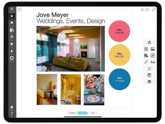
I find many people are scared of color initially, as they think it will be juvenile but once they see the many ways it can be incorporated they are pleasantly surprised and eager to dive into the rainbow with me! Color inspires joy and who doesn’t want to be surrounded by that!?!”
Kenzie Perry
@ze_haus | Miami, US

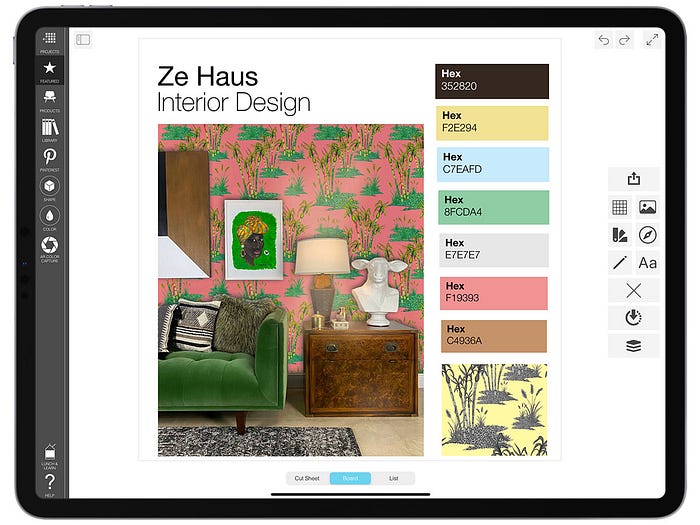
“Nature and its vivid hues are the dominant sources that inspire the way I play with color. It is filled with bountiful color stories and moments that can be captured and rendered in a scheme. Whether the neutral tones of sandy beach or the bright green of dewey sugar cane, I use colors that evoke these natural phenomena and amplify them in a way that reflects my own culture and heritage or that of my clients.”
Terri Loewenthal
@lowandtall | California, US

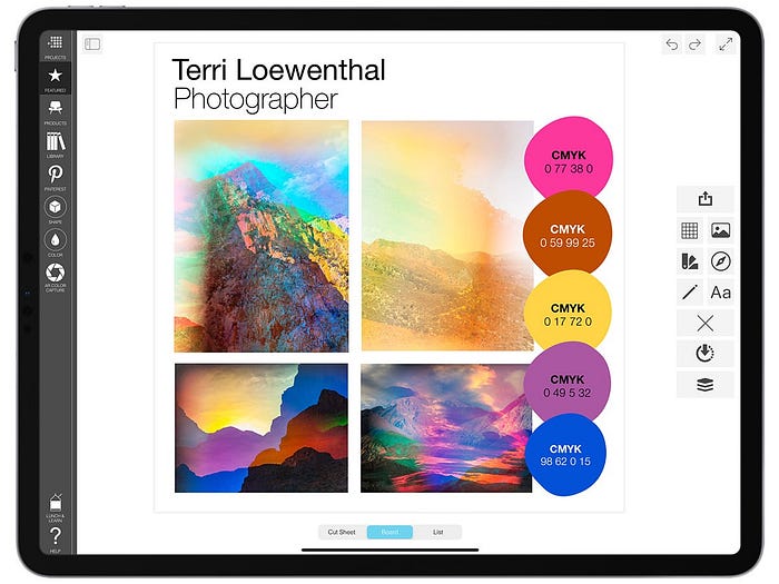
“My work draws upon the history of landscape photography, reimagining the genre in a psychedelic light. Each image is a single-exposure, in-camera composition that utilizes special optics I developed to compress vast spaces into complex, evocative environments. My technique shifts colors into oversaturated hues and overlaps multiple vantage points, offering the viewer a revelatory experience of the landscape.
Color is a secret backdoor to the soul. Like a soundtrack to a film, color tells us how to feel. The colors I choose are very much a representation of how I’m feeling in the moment while shooting.”
Jaime Derringer
@designmilk | San Diego, CA


“While the Design Milk brand has traditionally been black and white (and sometimes shades of gray!), we LOVE color! Modern design is all about taking risks and being bold. From Bauhaus to mid-century to Memphis, the infusion of color in design is a sure way to catch the eye.
Our Summer vibe is Bright + BOLD! I’m thinking about bright beach umbrellas, colorful floral explosions, graphic patterns, fireworks — anything vibrant and fresh to bring more happy into your home. I’ve selected some Bright + Bold items from the Design Milk Shop to serve as an inspiring color palette that will make your place pop!”
Amelia Ayerst
@duohue | Bristol, UK
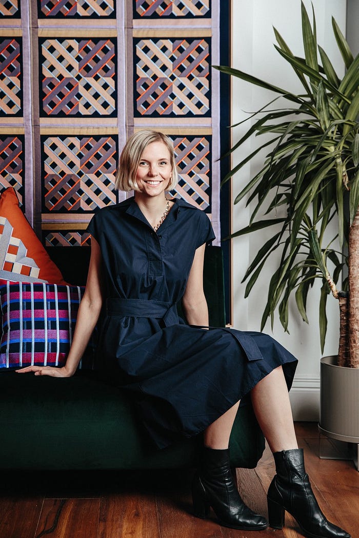
“My first collection for DUO-HUE was very much influenced by my travels around India — I visited just before the first national lockdown. I was inspired by the country’s vast array of color and movement, and I wanted to create designs that would reflect the excitement of color when applied to home and lifestyle products. Victor Vaserly’s series book was also a great inspiration and motivation for my work during lockdown when I couldn’t go out and see the world! Color, movement and how people interact is something that I have always been drawn to.
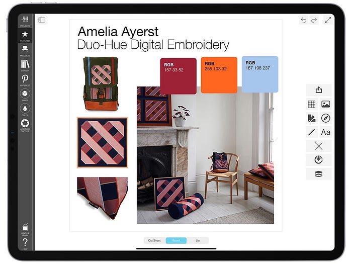
My work is based around layering different stitches to create color shifts when the product moves, so I have to experiment and understand how colors react with each other. When I first started my business I stuck to two darker base colors which I then play around with to create illusions, stitches and patterns.”
Rooshad Shroff
@rooshadshroff | Mumbai, India
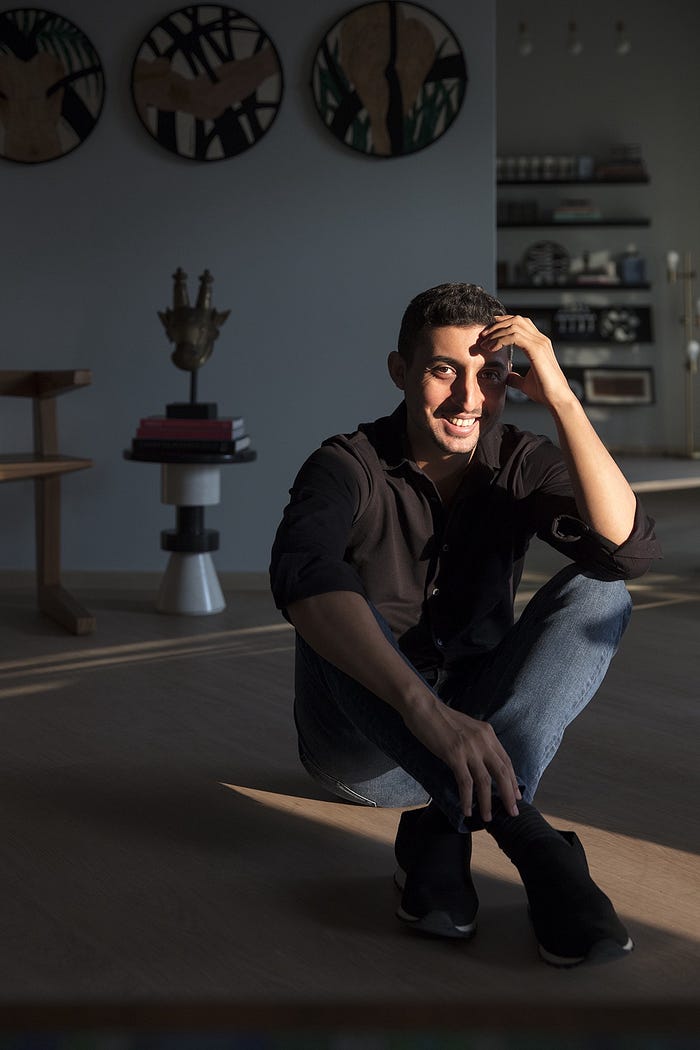
“As we work on a diverse range of projects from architecture to interiors to furniture, even windows displays for Hermes, there’s not typically a single point source of inspiration or colorway that I always use. For architecture and interiors I gravitate towards more neutral colors, shades of grey are often a go-to. However, I do embrace color more boldly when it comes to furniture, embroideries or window displays. Frequently, the color stories emerge from early conceptual research — primarily art.”

Charlotte Lucas
@charlottehlucas | Charlotte, US

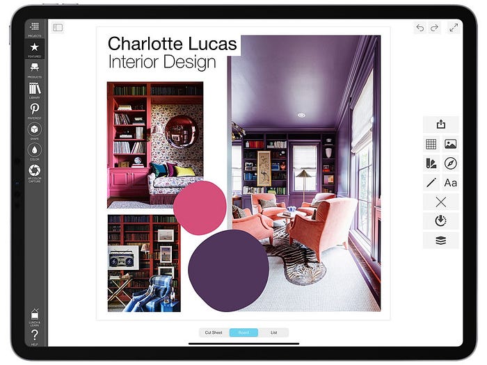
“As a wallpaper enthusiast, I actually find selecting specific paint colors quite challenging! When it comes to picking a specific hue, I hear my clients out on exactly what ambiance they are looking to achieve, what colors they’re drawn to, what colors they absolutely hate, and then put my own spin on their answers. I am a big believer in not doing exactly what the client envisioned or saw on Pinterest. It’s my job as their designer to push the limits and create their vision, but in an unexpected way…and sometimes that means painting the walls of their home office and library PURPLE! This rich shade created the perfect environment for burning the midnight oil, but also an ideal spot to relax & enjoy a cocktail after a long day’s work.”
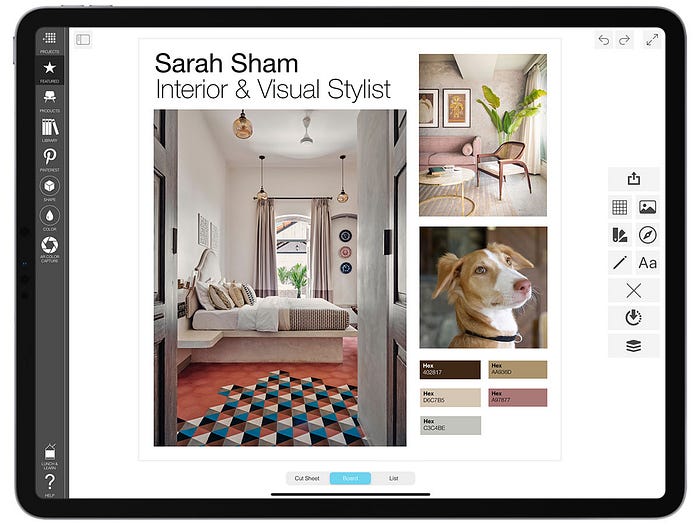
Sarah Sham
@essajeesatelier | Mumbai, India

The interior design arm of Essajees, a 106-year-old company, Essajees Atelier was established in 2014 by Sarah as an independent design practice founded on the legacy and ethos of the Essajees brand. Among Mumbai’s best, Essajees deals with art, antiques, and collectibles as well as bespoke flooring and furniture. Sarah’s work builds on this sophisticated heritage, but adds her own soft, approachable aesthetic.
“I am inspired by color in the everyday things — one of the combinations of color I love the most is the brown and white shades on my adorable dog. I’ve been dying to use those colors on a project of mine!”
Sarah Twigg Doyle
@retwiggdstylist | Bray, Ireland
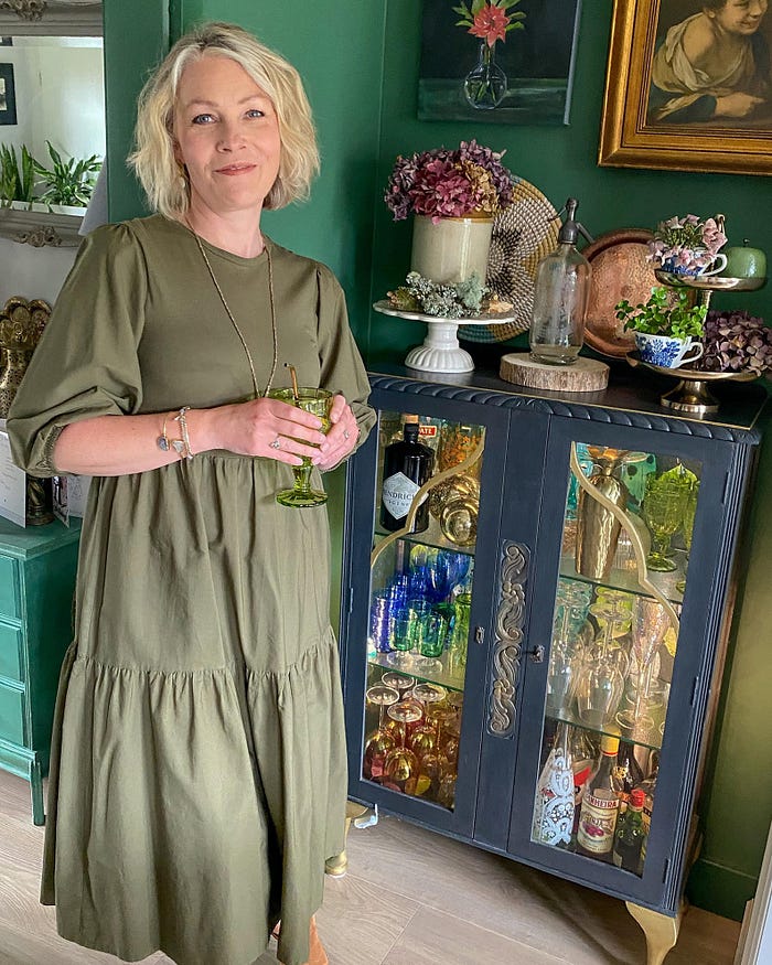
From the deep greens of woodland forests, to the lush Irish landscapes, the soft and rich pinks of the most beautiful petals, to the rusts and ochres of Autumn’s carpet. When it comes to picking color, my advice is to ignore whats on trend, focusing instead on what makes your heart skip a beat when you look at the paint chart!”
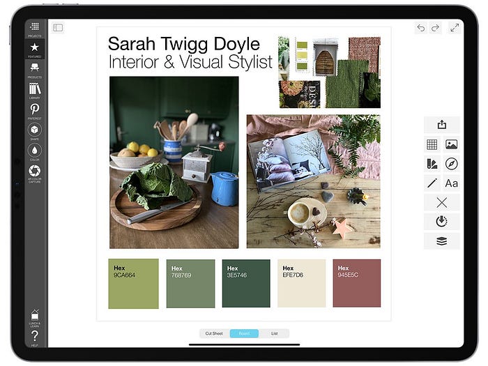
“Each day I find myself awe inspired by the beauty of nature and our natural world. It’s resources offer me a go-to color palette when I’m creating spaces for both clients and my own home. From the deep greens of woodland forests, to the lush Irish landscapes, the soft and rich pinks of the most beautiful petals, to the rusts and ochres of Autumn’s carpet. When it comes to picking color, my advice is to ignore whats on trend, focusing instead on what makes your heart skip a beat when you look at the paint chart!”
Achuli Design
@achulidesign | Nairobi, Kenya

“We are very much inspired by the colors of the Kenyan coast. We spend a lot of time along the entire coast taking it all in, such as the blue of the Indian Ocean, the warm colors of the island of Lamu, and the burst of green in the beautiful small coastal town of Watamu. And we love ALL pastels.”

Ana Hernandez
@masquespacio_ana | Valencia, Spain

“At Bun Turin, the idea to play with one color for each window creates a visual effect from the outside that makes the spectator from the exterior walk from one visual world into the other, traveling through different experiences in the same space.
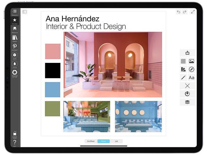
The already iconic green color from Bun is the one that takes you immediately to the order bar, while the pink and blue colors take you to two seating spaces that differ completely from each other. In the pink space you can see how next to a sharing table, an arcade that continues the arc concept is set-up to give the diners the possibility to sit at different levels. The blue zone on the other hand adds a touch of fun and gives the visitors the chance to enjoy the delicious Bun burgers in a space that simulates a huge swimming pool.”
Check out how to add swatches to your boards using Swatch Maker here.
Learn more about Board Pro, the “Best App” for interior designers, and download Board Pro on your iPad, iPhone, or Mac.
Share your work on Instagram! Tag @morpholioboard and “Created in #MorpholioBoard” to be featured!
